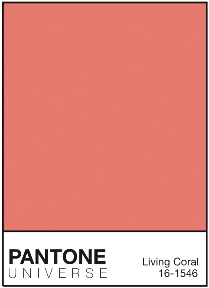
Some people wait all year for it. Some people have no idea what it is. Some people couldn’t care less. Like it or not, the Pantone Color of the Year is here, and remains a staple of the world’s artistic community.
This year’s color, Living Coral, was chosen to encourage lighthearted activity and to increase authenticity and intimacy. This peachy orange pick was also chosen for its ability to connect, a symbol for humans’ natural desire for optimism.
Senior fashion merchandising major Lauren Lee said, “Usually the Color of the Year appears first in fashion items. It has some effect on my style since big retailers use it.”
For 20 years, the Pantone Institute has chosen a color of the year. Influence on product development and purchasing decisions in multiple industries, including fashion, home furnishings and industrial design, as well as product, packaging and graphic design, has been a natural consequence of the yearly staple color for two decades. The selection process requires thoughtful consideration and the analysis of trends in which Pantone’s color experts explore the world in search of color influences.
Tara Finley, Senior graphic design major said she is less impressed with the Pantone Color of the Year than other years but still finds inspiration from the color in her designs.
“I think that it sets the tone for the year,” Finley said “Pantone comes out with these colors as a prediction for the way design trends are going to go. It’s also a basis for what consumers are going to be looking for in designs. When given the opportunity to incorporate the Pantone Color of the Year in your design, it’s just a good idea. It’s a building block.”
One of the most notable Pantone Color of the Year was in 2016 when two colors were chosen. The shades of Rose Quartz and Serenity were a softer pick for the color of the year. Chosen in some of the earlier stages of the gender equality and fluidity movements, this was a stance on not being typecast and opening audiences’ eyes to the different ways that color can be used. The rose quartz color was used to communicate compassion and equilibrium while serenity conveyed the feeling of fresh air the sky gives us creating the feeling of composure in the valleys of our lives.
The Pantone Color of the Year encapsulates the year in preview, showing us all the inspiration for the year ahead whether we asked for it or not.
