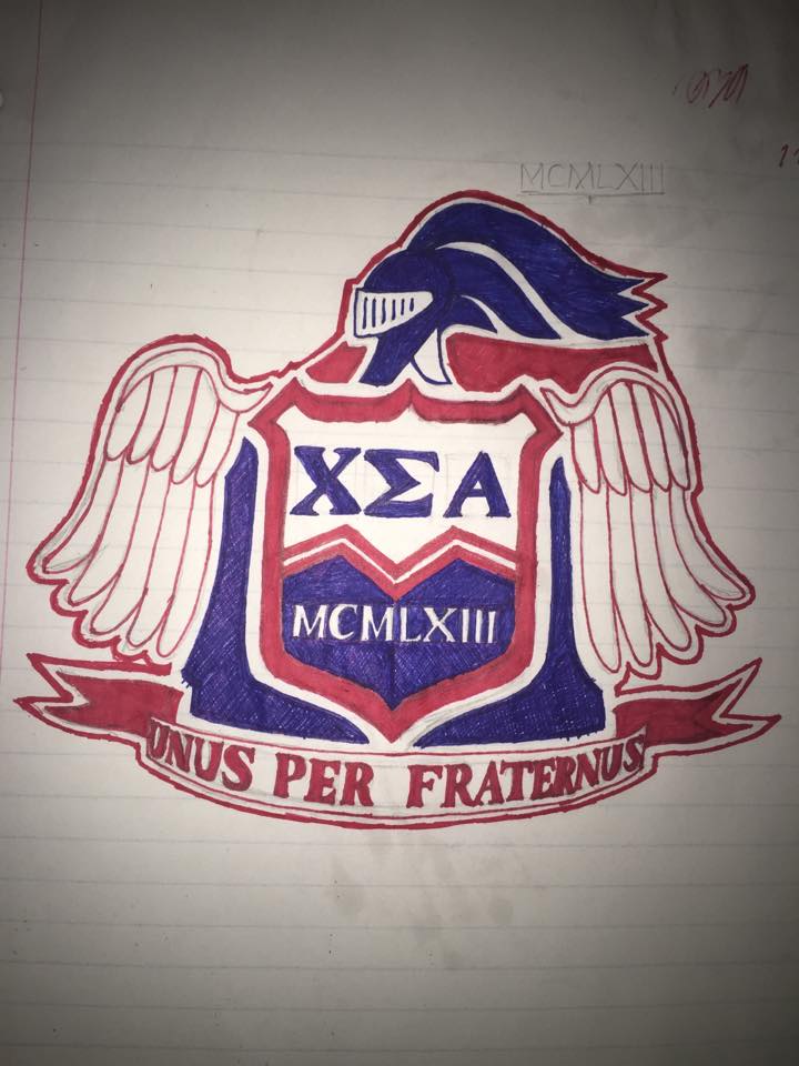
Men’s social club Chi Sigma Alpha has decided to update their official logo due to its similarities to the Confederate flag.
Senior Luke Kays, Chi Sigma Alpha president, said the decision was made on the first week of school in light of discussions and controversies over the Confederate flag in the news this summer. Kays said that he was approached by Assistant Dean of Student Life Kara Abston and multiple club members who felt it was best to ensure the emblem would not offend anyone.
Junior Chi Sigma Alpha member Levi Bogus said updating the logo is meant to communicate to the student body that the club is no longer affiliated with any of the ideology the Confederate flag represents.
“With the connotation that the confederate flag now holds, we felt it best to no longer have that image attached to our brotherhood,” Bogus said.
Although Abston suggested simply updating the existing logo by removing or repositioning the blue lines and stars, Kays decided to open up the redesign opportunity to the entire club. Kays said all members and queens had the option to send in their best designs. Kays said he received about five potential designs, which he then posted to the club Facebook page. The two designs that received the most “likes” were brought to a special meeting and members voted between them in person.
Kays said there was plenty of discussion about the future of the logo at this meeting.
“We had several people who felt it was disrespectful to people who had been in the club to completely change (the logo),” Kays said. “Others said this was an opportunity to make a mark on history and take a step in a new direction. We probably could have talked for well over the half hour that we did.”
Ultimately, a hand-drawn design created by sophomore Eli Andrews was chosen. Andrews said he was not expecting his design to win, he just enjoys sketching and thought it would be fun to enter and potentially make history.
“I’m just the guy who draws,” Andrews said. “I’m just as amazed as everybody else that it won. For me it was an excuse to draw, but also a way to preserve our club because (the logo) is the first thing that people see. I wanted to make this more lasting and impactful than my other (drawings).”
Andrews said he researched real coats of arms before tackling the new logo. In his redesign, Confederate symbols are completely deleted and features such as the wings on each side and the knight at the top have been updated to look “more regal,” according to Andrews.
“I wanted to create something that would stand another 50 years and that people would take seriously,” Andrews said.
Senior Chi Sigma Alpha member Adam Jackson is working on digitizing the new design so that it can be used on future club paraphernalia, including flags used at club events and merchandise.
Kays said that club members are enthusiastic about the new logo because it connects the club’s past to its future.
“We are excited about the new crest because it still has elements from the old one, but it’s a new design that represents who we are today,” Kays said. “It shows how we have grown through the years and that we are no longer what we were founded on.”
